


TradingKey - If you ever have been overwhelmed by a wall of numbers, don't worry, you are not alone. Markets are powered by rivers of data, and trying to discern where money is truly moving, and why, can seem like trying to read tea leaves in a hurricane. That's where heatmaps and capital flow trackers are useful.
They take noisy raw data and translate them into easy-to-spot visual signals you can act upon. And 2025, when money is sloshing back and forth between sectors at record speed, these are the secret weapons of choice all the way down the spectrum - day traders, through long-term investors, trying to time their entries, not to mention when to desist chasing yesterday's winners.
.jpg)
Source: TradingView
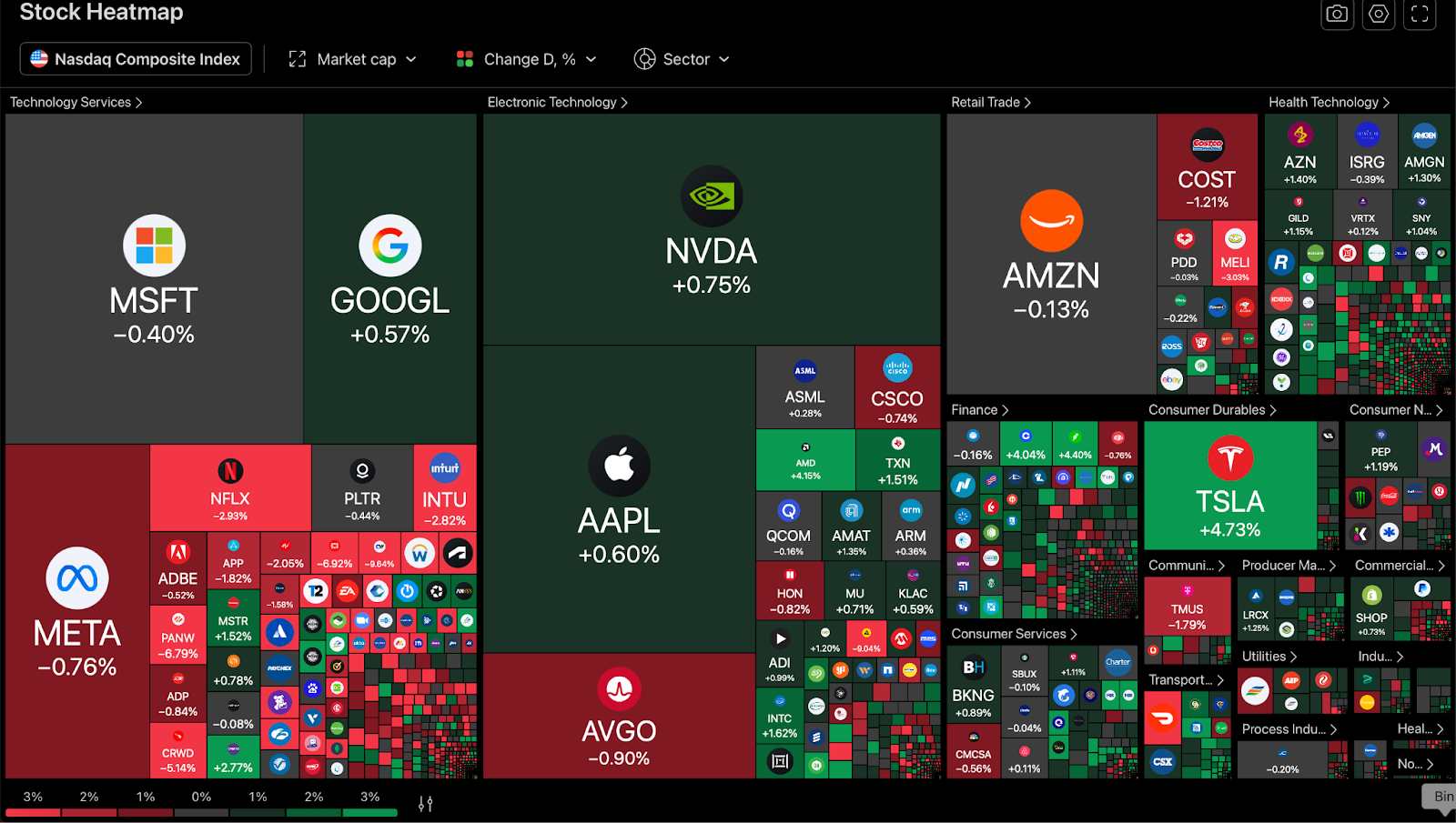
Heatmaps: From Data to Visual Clarity
Think about a heatmap as a living picture of sentiment within the marketplace. Instead of a table of tickers and figures, you get a table, color-coded, of strong greens for leaders, dark reds for losers, and all the colors in the middle. You know instantly what’s red-hot and what’s cooling off, all in a quick glance.
Professional traders have been using order-book heatmaps for decades,especially in highly volatile segments like futures and forex. For equity investors, sector/ETF heatmaps show you which industries are lighting up, which are rolling over, and whether momentum is broad-based or concentrated to just a select group of giants.
It's a visualization edge that makes a difference in 2025's marketplace. Inflows to retail are going to extremes in certain segments, and a heatmap can allow you to glimpse when a corner of your portfolio becomes too hot to touch. You might spot an unfavoured slice, a cold spot that's long overdue to bounce back. It's not magic, it's just a matter of recognizing patterns, demystified.
Source: TradingView
Capital Flow Trackers: tracing the Steps of the Big Money
If heatmaps show you where the energy is, capital flow trackers show you why it's going, and whether it's going to stay. That's the big-picture stuff: what's buying, what's selling, and how much dry powder is sitting on the sidelines.
In practice, these trackers gather fund flows, ETF creation and redemption data, and occasionally even cross-country investment flows. Assume that your heatmap shows industrial stocks lighting up green. You take a look at the flow tracker, and you see a new money surge into industrial-oriented ETFs during the past week. That’s a certainty that real money is indeed flowing in, a temporary sentiment spike, not.
Some investors monitor international capital flows for signs of macro changes: i.e., when the dollar softens, you might witness a rotation out of the emerging markets or the commodity-stuffed segments. J.P. Morgan's capital flow dashboards or self-contained models like the SEAF (Sector ETF Asset Flows) model tell you which corners of the marketplace are gaining new dollars, and which are quietly leaking out the back door.
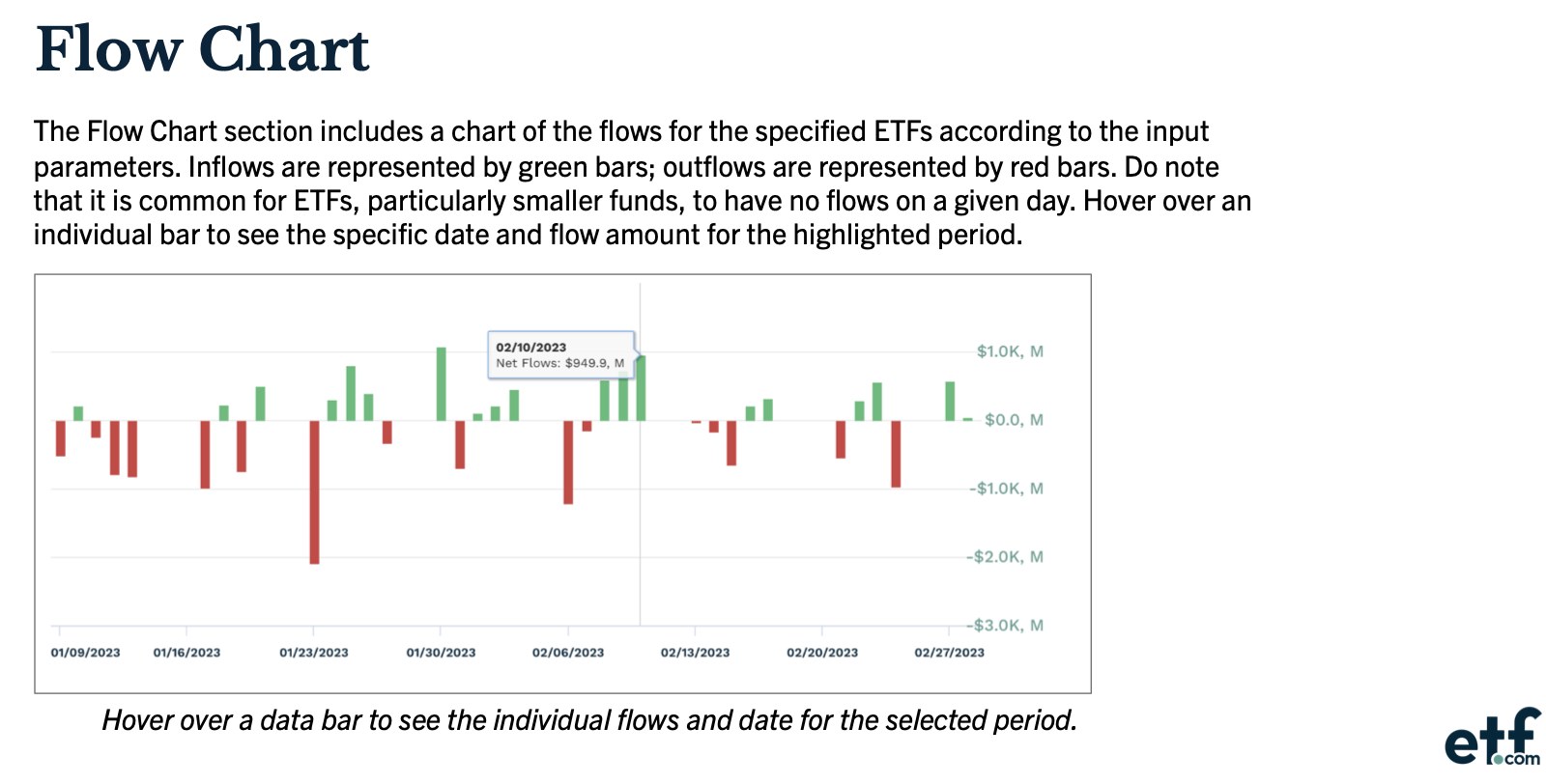
Source: etf.com
Collaborative Work: A Clearer Focus for the Market
The actual wizardry is when you place these resources side by side. You have your eye on the energy space. Your heatmap shows you a giant spike in refiners, heavy green, strong short-term winners. You go to the flows and you see the midstream pipeline ETFs have shown consistent new inflows for three weeks. Add it all together, and you have a stronger indicator: it’s not all spec money chasing the headlines; there’s consistent money behind the move.
Likewise, a sector can light up a heatmap today while showing weeks of bad capital flows, a red flag the rally is about to pop soon. When you merge visual signs and real cash flow, you are not guessing, you are viewing the marketplace pulse real time.
What to Watch For: False Signals Do Exist
Like any other market tool, flow trackers and heatmaps aren't perfect. Illiquid stocks might look hotter than they are. Bifocal, one-day spikes can deceive the flow narrative when they are just a product of a solitary hedge fund rebalancing. And a short-term pop or two are fueled by momentum traders that can disappear as fast as they arrive. Experienced investors use the tools as a guide, not a crystal ball, rounding them out with good, old-fashioned fundamentals.
So if you see tech lighting up but the valuations look stretched, the flows could enable you to confirm the question of money indeed remaining versus all just going through the pipes. If you get a cold spot, probe: maybe that corner's been left to die for a reason, maybe it's a gem-sized turnaround tucked inside.
Final Take: Smarter Moves with Visual Tools
Heatmaps and capital flow trackers place you in the first row seats of the marketplace internal wiring. They don't necessarily turn you into a seer, but they surely make you a lot less oblivious. Using them effectively enables you to peer into areas of conviction building, pick crowded trades set to blow, and balance enthusiasm with reality.
In a place where money moves at light speed, that extra level of comprehension could be the difference between going with the herd and running just a little bit ahead of the herd. Next time you find yourself dazed and confused by charts and numbers, back away, grab your heatmap and flow tracker, and have a gander at what the big picture really says. Sometimes the best decision isn’t a hunch, sometimes it’s following the trail of real money, wherever the trail may take you.
