


TradingKey - Affected by U.S. tariff policies, the U.S. stock market faced a poor start in March. Following President Trump's announcement of tariffs against Canada and Mexico, the S&P 500 Index experienced its worst day of the year on Monday, plummeting 1.76% in a single day.
On Tuesday, the index fell as much as 2% during trading, coming close to its 200-day moving average before closing at 1.22%. Since President Trump took office in January, tech stocks have declined by over 7%, as new trade measures have sparked a trade war and further intensified Wall Street's risk-averse sentiment.
As a retail investor, you may often find yourself puzzled by questions like: "Why does stock price drop when good news is announced?" and "How should I interpret support and resistance levels?"
Don't worry; today we will start from scratch and help you build a practical framework for technical analysis knowledge so that you won't feel lost the next time you observe the market.
What Types of Charts Are There?
For beginners opening stock trading software, the plethora of charts can be overwhelming: “What do the red bars and green bars mean? What is this wavy line trying to say?”
This marks the first hurdle in technical analysis.
Learning about the common types of charts in the stock market is essential to extracting useful investment information from them.
Line Chart
A line chart represents a stock's "growth curve," connecting daily closing prices to form a smooth line.
Its simple and intuitive nature makes it particularly suitable for beginners to judge long-term trends quickly.
For instance, if a stock price consistently climbs along the line, it indicates bullish sentiment; conversely, if the line flattens out or even declines, it may suggest that the market is adjusting.
However, a line chart may not provide detailed information on price behavior during that period.
For example, if one day a stock price fluctuates dramatically between hitting its upper limit and dropping to its lower limit, the line chart would only display a slight decrease in the closing price, concealing the severe volatility in between.
.jpg)
(Source: Shutterstock)
Bar Chart
A bar chart primarily illustrates variations in trading volume over a designated timeframe.
In a bar chart, each bar represents trading volume for a particular time frame (such as one day or one week), with the height of each bar proportional to its trading volume.
By observing changes in bar height, investors can intuitively see trends in increases or decreases in trading volume.
.jpg)
(Source: Shutterstock)
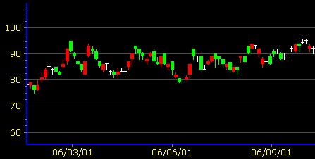
Candlestick Chart
The candlestick chart, originating from Japan during the Tokugawa shogunate era and initially used to track rice market prices and fluctuations, has become one of the most widely used charts worldwide in stock markets today.
It is somewhat more complex compared to the other two types of charts.
(Source: Wikipedia)
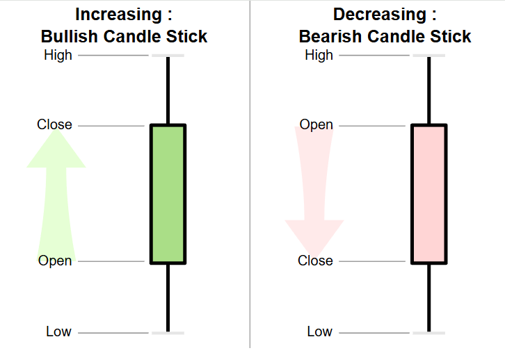
The candlestick chart depicts changes in price throughout a specific period, utilizing four crucial price points: the opening price, closing price, highest price, and lowest price.
Let’s break down these key elements using daily bars as an example:
Body: The middle portion represents the difference between opening and closing prices.
Bullish Candle (Red/ Hollow): When closing price > opening price indicates bullishness—for example, if a stock rises from 10 yuan to 12 yuan, its body will represent that range as a red candle spanning from 10-12 yuan.
Bearish Candle (Green/ Solid): When closing price < opening price suggests bearishness—for example, if a stock falls from 12 yuan to 10 yuan, its body will reflect that range as a green candle spanning from 12-10 yuan.
Wicks/Shadows: The lines extending above and below represent extreme prices.
Upper Shadow: The fine line above the body shows that day’s peak; for instance, if a stock spikes up to 13 yuan before retreating downwards with an upper shadow representing ranges like 12-13 yuan (for bullish candles) or 10-13 yuan (for bearish candles).
Lower Shadow: The fine line below shows that day’s lowest point; for instance when a stock drops down to 9 yuan before bouncing back up—the lower shadow would illustrate ranges like 9-10 yuan (for bullish candles) or 9-12 yuan (for bearish candles).
(Source: Wikipedia)
How do you choose?
Scenario | Recommended Chart | Reason |
Short-term trading (looking at daily fluctuations) | K-Line Chart | Details of long and short positions, capturing reversal signals |
Quick overview of weekly trends | Bar Chart | Clear and straightforward, easily showing volatility intensity |
Analyzing long-term trends (over six months) | Line Chart | Filters out short-term noise, focusing on the overall direction |
What Are the Main Technical Indicators?
Technical indicators are mathematical calculations based on historical price and trading volume data that traders use to predict future price movements.
These indicators are essential tools in technical analysis, providing insights into market trends and investor behavior.
The most common types of technical indicators include Moving Averages (MA) and the Relative Strength Index (RSI), each serving distinct analytical purposes in trading.
Moving Averages (MA)
Moving averages act as a "smoothing filter" for stock prices by filtering out short-term fluctuations to reveal long-term trends.
For instance, to determine whether a given stock is trending upwards (bullish) or downwards (bearish), one can simply observe if its moving average is rising or falling.
Simple Moving Average (SMA): This indicator calculates the average of closing prices over the past N days—simple and direct.
Exponential Moving Average (EMA): This type gives greater importance to more recent prices, making it more sensitive to short-term shifts.
Weighted Moving Average (WMA): This average allocates weights based on how recent a price is—closer prices have a greater impact, making it ideal for capturing medium-term trends.
Below is a visualization displaying three types of 20-day moving averages: SMA, EMA, and WMA.

The chart shows three 20-day moving averages - SMA, EMA, and WMA.
(Source: Wikipedia)
Moving averages are also effective in pinpointing support and resistance levels.
If a stock price rises but then retraces near its moving average before bouncing back up, this indicates that the moving average acts as a “support line.”
Conversely, if the stock price declines but rebounds only to fall back upon hitting the moving average again, it suggests that this line serves as a “resistance line.”
Additionally, moving averages help identify trend direction:
When a short-term average (like the 5-day line) crosses above a long-term average (such as the 20-day line), it's known as a “golden cross,” which may signal buying opportunities.
Conversely, if a short-term average crosses below its long-term counterpart, it's referred to as a “death cross,” indicating it may be time to sell.
Relative Strength Index (RSI)
The RSI ranges from 0 to 100 and serves as an indicator of market momentum; higher values reflect stronger buying interest:
An RSI > 70 suggests excessive buying pressure leading potentially to overbought conditions.
An RSI < 30 indicates intense selling pressure resulting in overly sold conditions that might lead to rebound opportunities.
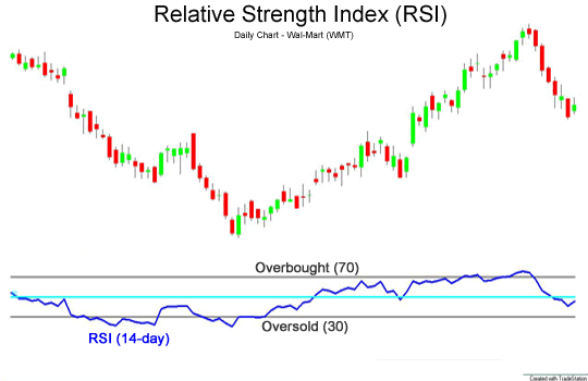
The above picture is a candlestick chart, and the picture below is a 14-day RSI, where the overbought zone is set above 70; the oversold zone is set below 30.
(Source: Wikipedia)
Interpreting Crossing Signals with RSI
Investors often utilize price movements alongside crossing signals in RSI when deciding on entry or exit points:
A break upward through an RSI level above 30 from oversold territory could signal buying opportunities.
Conversely, if the RSI dips downward through levels below 70 from overbought territory—it might warrant selling considerations.
Another important concept is divergence; this occurs when contradicting signals between stock prices and RSI arise:
If stock prices hit new highs while RSI does not follow suit—in essence marking what’s called “bearish divergence”—this may hint at slowing momentum.
Alternatively, if stocks reach new lows yet disregard corresponding drops in RSI—it symbolizes “bullish divergence,” akin to runners falling forward yet still pushing their hands ahead; suggesting impending recovery possibilities.
Why Should You Not Rely on Just One Indicator?
Just like you cannot determine health conditions by measuring only body temperature during medical evaluations—technical indicators require multiple perspectives too since relying solely on one indicator risks missing key information.
For example:
If moving averages predict bullishness but RSI indicates overbought conditions—it might suggest nearing “the end of exhaustion,” prompting potential short-term adjustments against prevailing long-term trends.
If RSIs indicate oversold positions yet trading volumes remain lackluster—it could suggest false alarms since continuing drops might persist without significant buyer engagement visible.
The recommended approach combines both moving averages with RSIs—akin to simultaneously monitoring both body temperature readings along with routine blood tests during health assessments where moving averages affirm trend direction while RSIs assist with timing entry points fortified by validating volume checks ensuring signal reliability.