


TradingKey - The oil market is known for its extreme volatility — prices fluctuate rapidly, and emotional trading is evident. However, if you can leverage the right tools, the trading landscape can become clearer.
Let's take a look at three technical indicators that serve as visual representations of "emotion and trend" in the oil market, helping you avoid the pitfalls of trading based on gut feeling.
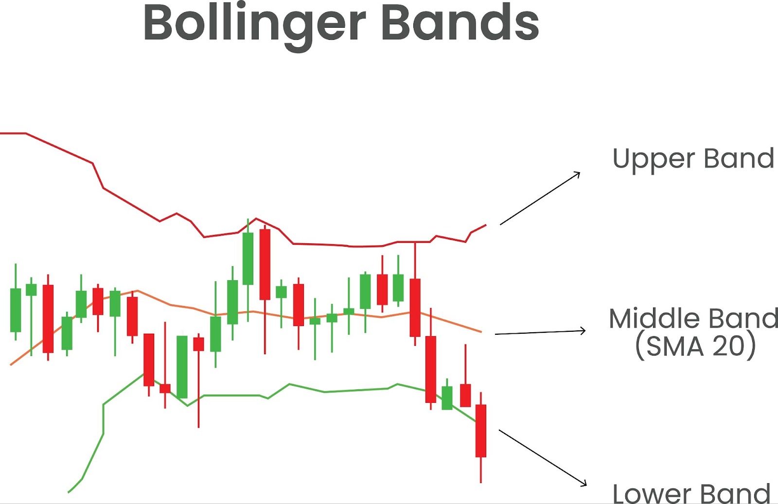
How Do Bollinger Bands Work?
First, let's briefly introduce Bollinger Bands.
These consist of three lines: the center line denotes a 20-day moving average, which indicates the medium-term price trend. The upper and lower bands are calculated by adding and subtracting two standard deviations from the middle line, representing the boundaries of price fluctuation.
Together, these three lines create an "elastic channel" that defines the range of fluctuations in oil prices.
When the market is calm, the Bollinger Bands' bandwidth narrows. Conversely, during periods of intense volatility, bandwidth expands, indicating that a trend is accelerating.
(Source: Shutterstock)
What Other Functions Do Bollinger Bands Have?
Identifying Overbought or Oversold Conditions
Bollinger Bands can help you recognize whether the market is overbought or oversold.
When prices break above the upper band and enter the "overbought zone," it indicates that prices have risen too quickly in a short period; hence, there’s an increased probability of a pullback.
On the other hand, when prices fall below the lower band and enter the "oversold zone," it means prices have dropped excessively, increasing chances for a rebound.
Confirming Breakout Direction
When prices stabilize above the upper band accompanied by expanding bandwidths, it signals that bullish trends are strengthening.
Conversely, if prices break below the lower band with increasing volume, bearish trends may be emerging — similar to a ship losing control in a storm.
Distinguishing Between Consolidation and Trends
When prices oscillate between the middle band and upper/lower bands back and forth like someone wandering in a narrow passageway, this indicates consolidation. In such situations, it's suitable for buying low and selling high — capitalizing on price fluctuations between bands.
In strong trending markets, prices usually move along either band, like trains speedily traveling along tracks. At this point, you should hold positions in line with prevailing trends to maximize your profits.
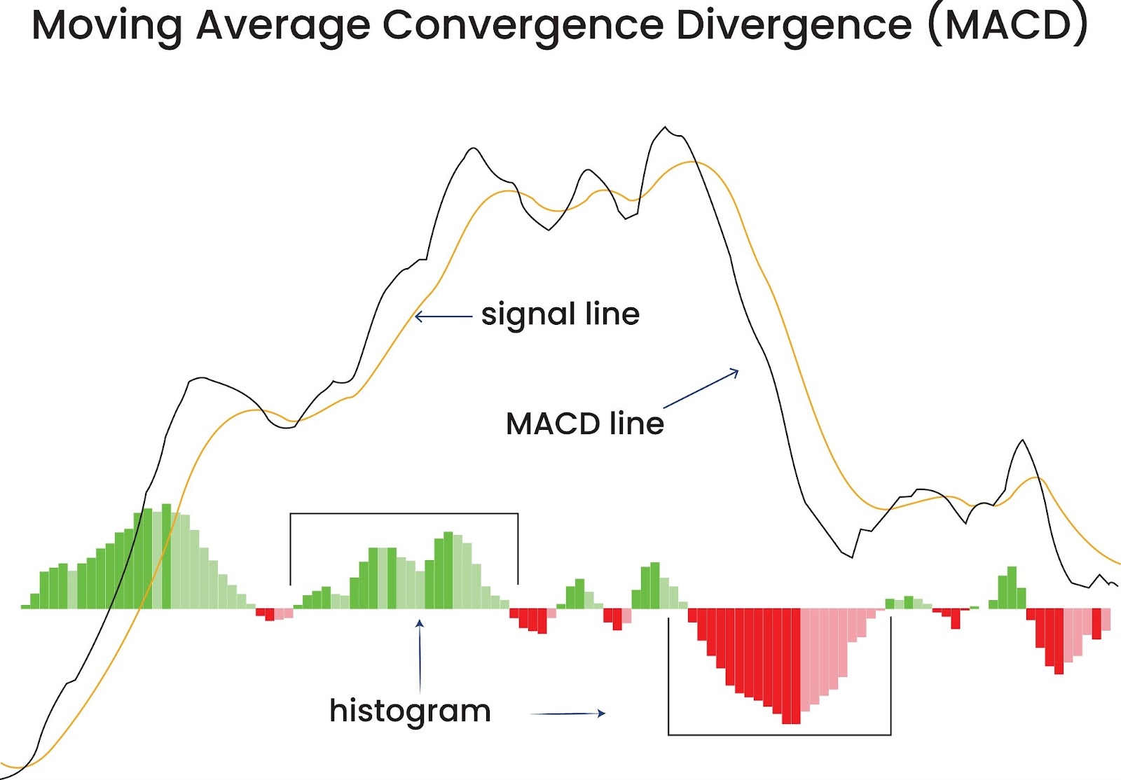
How Does MACD Function in the Oil Market?
MACD consists of three key lines: the fast line (DIF), the slow line (DEA), and the histogram (BAR).
Fast Line (DIF): This is the difference between the 12-day Exponential Moving Average (EMA) and the 26-day EMA, making it highly sensitive to short-term market fluctuations. It quickly reflects price changes.
Slow Line (DEA): This is the 9-day EMA of DIF, focusing on long-term trends. It smooths out short-term volatility, providing more stable trend signals.
Histogram (BAR): This visually represents the comparison of bullish and bearish forces; red bars indicate bullish dominance, while green bars show bearish strength.
(Source: Shutterstock)
What Do MACD Readings Indicate About Market Trends?
When the MACD is positioned above the zero line, it indicates that the market is experiencing a bullish uptrend. Investors can take advantage of this trend by going long and seizing opportunities for upward movement.
On the other hand, when the MACD falls below the zero line, it suggests that the market has moved into a bearish downtrend, similar to entering a harsh winter. Investors should be cautious and refrain from making impulsive long positions.
How Can MACD Help You Time Your Entry?
MACD not only assists you in identifying trends but also helps you accurately filter entry points.
When a golden cross occurs above the zero line and the histogram shifts from green to red, it's like witnessing dawn's light break at sunrise—this serves as a high-probability buy signal where investors may consider entering long positions.
When a death cross appears below the zero line and the histogram transitions from red to green, decisive actions should be taken—either cutting losses or going short—to prevent further losses from escalating.
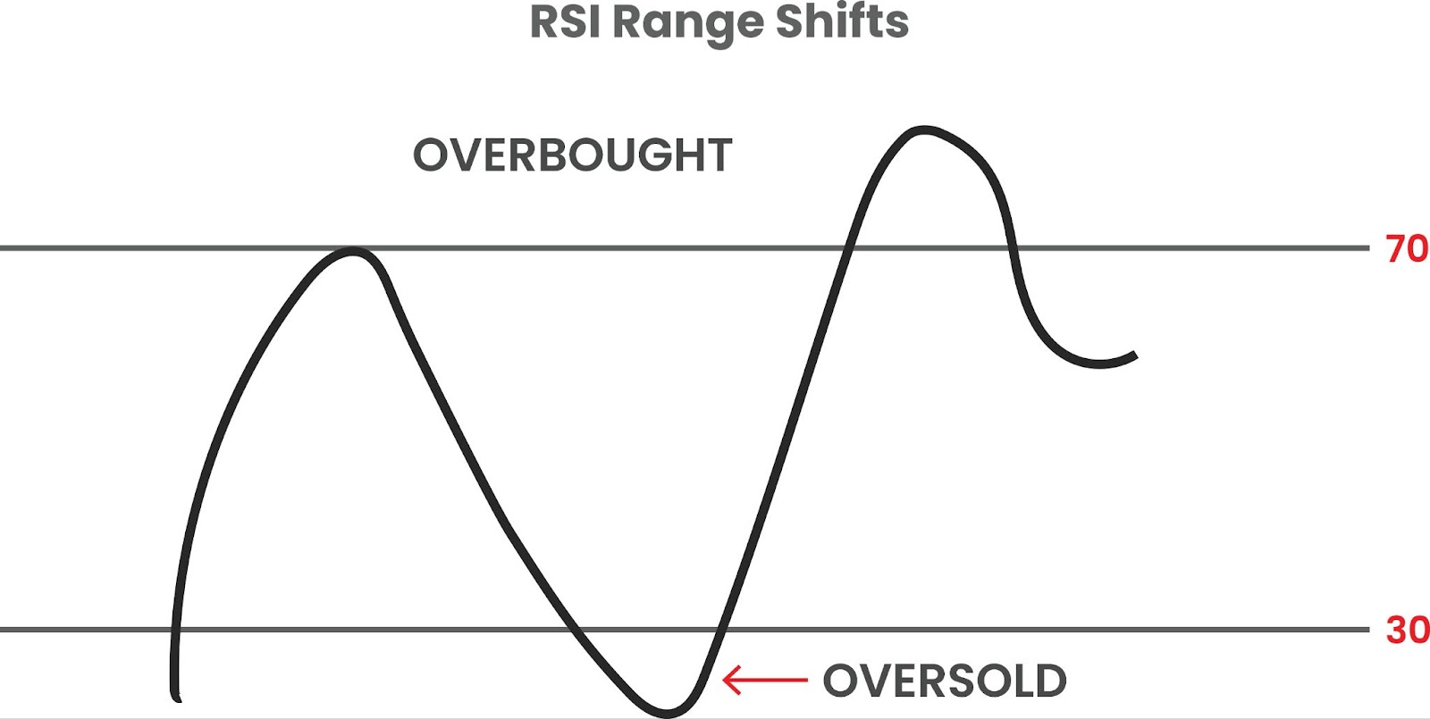
How to Use RSI in the Oil Market: Finding Trading Opportunities?
The RSI value ranges from 0 to 100. What do these values actually mean?
Overbought Zone (RSI > 70)
When RSI exceeds 70, it’s like a thermometer displaying excessively high temperatures—indicating that the market has entered the "overbought zone."
At this point, buying pressure is too strong, and prices may have risen too quickly and too sharply.
However, extremes often lead to reversals; this excessive enthusiasm is unlikely to sustain itself, and a market correction may occur at any moment due to exhaustion of buying power.
Oversold Zone (RSI < 30)
Conversely, when RSI falls below 30, the market has entered the "oversold zone."
This implies that selling pressure has almost exhausted itself, and prices may be excessively suppressed.
Neutral Zone (30-70)
In the "neutral zone" between 30 and 70, buying and selling forces are relatively balanced, placing the market in a more stable condition.
During this period, there is a higher probability for price trends to continue; however, you need to corroborate direction with other indicators for further confirmation.
(Source: Shutterstock)
Can Divergence Signals Really Alert Us to Trend Reversals?
What Is a Top Divergence?
When oil prices continuously hit new highs, but the RSI fails to surpass its previous peak and even begins to decline, this creates a "top divergence."
This situation indicates that although prices are still rising, bullish momentum is beginning to weaken. At this point, you need to stay vigilant; a market correction is likely on the horizon.
For example:
In August 2023, WTI crude oil prices climbed steadily, reaching a new short-term high; however, the RSI dropped from 75 to 70 and did not follow the price higher. Subsequently, oil prices dropped sharply by 5%, much like a kite losing its tether. This also serves as a reliable confirmation for the top divergence signal.
What Is a Bottom Divergence?
Conversely, when oil prices make new lows but the RSI stops declining early and even starts to rise, this constitutes a "bottom divergence."
This indicates that bearish momentum is weakening while bullish momentum begins to build—like darkness before dawn; it may seem bleak now, but light is not far away.
A bottom divergence often acts as a strong buy signal. You should keep an eye on it and take advantage of buying opportunities at the right time.
How Can You Use RSI for Contrarian Trading in Sideways Markets?
When RSI reaches 70, it suggests that the market has experienced excessive buying in the short term and that prices may have reached the upper boundary of their trading range.
At this point, you could consider initiating small short positions to capitalize on potential price pullbacks.
Conversely, when RSI falls below 30, excessive selling occurs in the market; therefore, prices may have dropped to the lower boundary of their trading range. In such cases, you could buy on dips while waiting for price rebounds.
However, it’s important to note:
In sideways markets, changes in price movement can often be complex.
Prices may break out of trading ranges at any moment and trigger trending conditions.
Thus, when employing contrarian strategies, you must set proper stop-loss levels.
How to Build a Multi-Indicator Coordinated Strategy for a Three-Dimensional Analysis System?
In the oil market, while individual indicators can be useful, they often come with their own limitations.
Relying solely on one indicator may lead to misjudging market trends, missing opportunities, or even incurring losses.
So how can you leverage a multi-indicator coordinated strategy to create a more comprehensive and precise analysis system?
How Can You Confirm Trends Using MA and MACD to Lock In the Big Direction?
To compensate for the shortcomings of single indicators, you can combine MA (Moving Averages) with MACD — a commonly used trend confirmation strategy.
When the 50-day moving average moves above the 200-day moving average, resulting in a "golden cross," it indicates a robust bullish trend and implies that the market is trending upward over the medium to long term. Conversely, when the 50-day moving average crosses below the 200-day moving average and forms a "death cross," this is bearish.
To further enhance signal accuracy, you should also observe whether MACD is operating above the zero line.
If MA forms a golden cross while MACD continues to rise above the zero line with increasing histogram bars, this further confirms the establishment of a bullish trend.
In the first half of 2024 in the oil market, when the 50-day moving average formed a golden cross with the 200-day moving average and MACD continued rising above zero, this series of signals collectively confirmed an upward trend.
Many investors took advantage of this opportunity and achieved substantial returns.
.jpg)
(Source: Freepik)
How Can You Accurately Time Entry Points Using Bollinger Bands and RSI?
The combination of Bollinger Bands and RSI can help you accurately grasp entry timing—particularly effective in both sideways and trending markets.
Retracement to Middle Band + RSI Support:
When oil prices retrace to touch the middle band of Bollinger Bands, it indicates an adjustment phase.
If at this time RSI finds support near 50, it means that buying and selling forces have momentarily reached equilibrium while bullish momentum shows signs of reaccumulating.
This represents an ideal point for increasing long positions; you might consider adding to your position accordingly.
Rebound to Upper Band + RSI Overbought:
When prices rebound to touch the upper band of Bollinger Bands while RSI enters overbought territory (>70), it’s like an athlete hitting their limit; they need to take a break.
At this point, there may be pressure for price corrections in the market. You can choose to take profits or initiate small short positions in anticipation of price pullbacks.
For example:
In November 2023, when oil prices rebounded to touch the upper band of Bollinger Bands while RSI reached 75, significant price corrections soon followed.
Those who promptly took profits or went short were able to successfully mitigate risks and achieve gains.
